Logos
The Arizona Western College logo is the strongest visual representation of the entire college. It embodies who we are and unites our different voices so that together we are stronger than the sum of our parts.
Policies
More than a mere visual mark, the AWC logo is the face of the institution and should be consistent across all mediums. Therefore, altering or recreating the logo is not permitted.
One-color variations of the logo (Black, White, Turquoise) can be requested through, and at the discretion of, Marketing & Communications at marketing@azwestern.edu.
Institutional Logos & Icons
When communicating externally on behalf of AWC, it's essential to use the institutional logo to uphold the college's brand standards. The institutional logo should be used for all communications outside of AWC. Below are the key details regarding the different versions of the institutional logo and their appropriate uses:
Primary Institutional Logo
Primary – Vertical
Primary Reverse – Vertical
- The Primary version of the Arizona Western College institutional logo consists of the college wordmark stacked under the AW icon.
- To ensure optimal visual impact when using an institutional logo, consider the primary version as your first choice.
- One color* and black/white versions of the institutional logo are also available.
Secondary Institutional Logo
Secondary – Horizontal
Secondary Reverse – Horizontal
- The Secondary version of the institutional logo consists of the college wordmark stacked to the right of the AW icon. Use this as your secondary option, if more applicable.
Institutional Icon
The AW icon may be used in conjunction with other institutional identifiers and not used alone without prior authorization from Marketing & Communications.
Most common uses of the AW icon are within small applications, social media, online, department logos, campus signage, flags, tablecloths, swag, and apparel.
Department Logos
When using department logos, it's important to adhere to specific guidelines to maintain consistency and brand integrity. The following key points outline how department logos should be used and the variations available:
- All department logos are only to be used within the AWC community.
- Department logos consist of the institutional icon and name of the department using the institutional font (Proxima Nova) separated by a rule.
- Logos available in full color and one color red, turquoise* or black.
- No other variations of a department logo are available, permitted, or will be created.
AWC Logo dos and don’ts
When using the Arizona Western College logo, it's important to follow specific guidelines to maintain brand consistency. Adhering to these rules ensures the logo is always represented in a clear and recognizable manner. Below are some key dos and don'ts to keep in mind.
Do use the logo proportionally
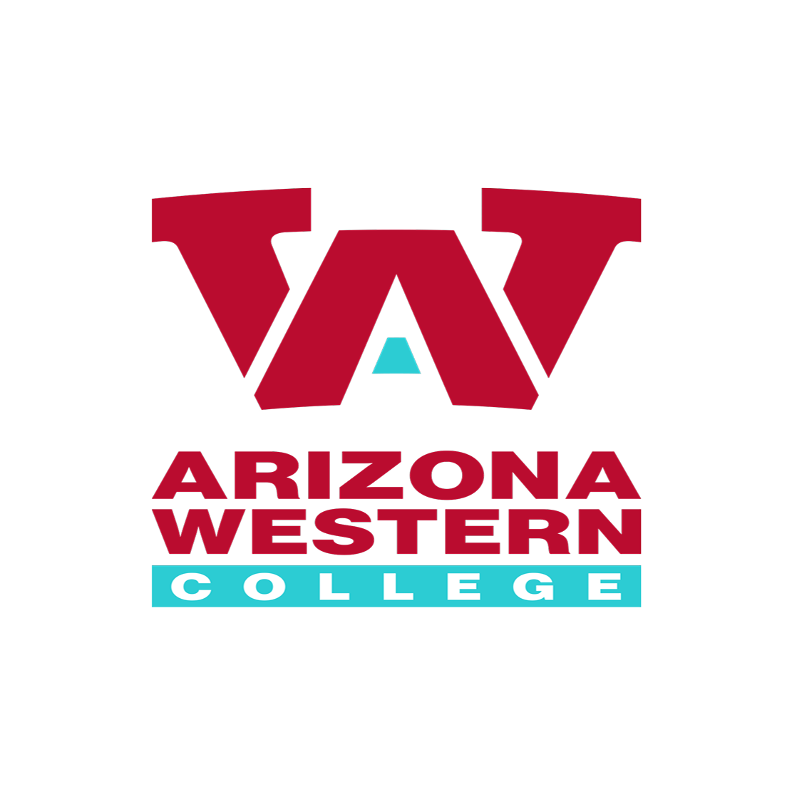
Do not stretch the logo
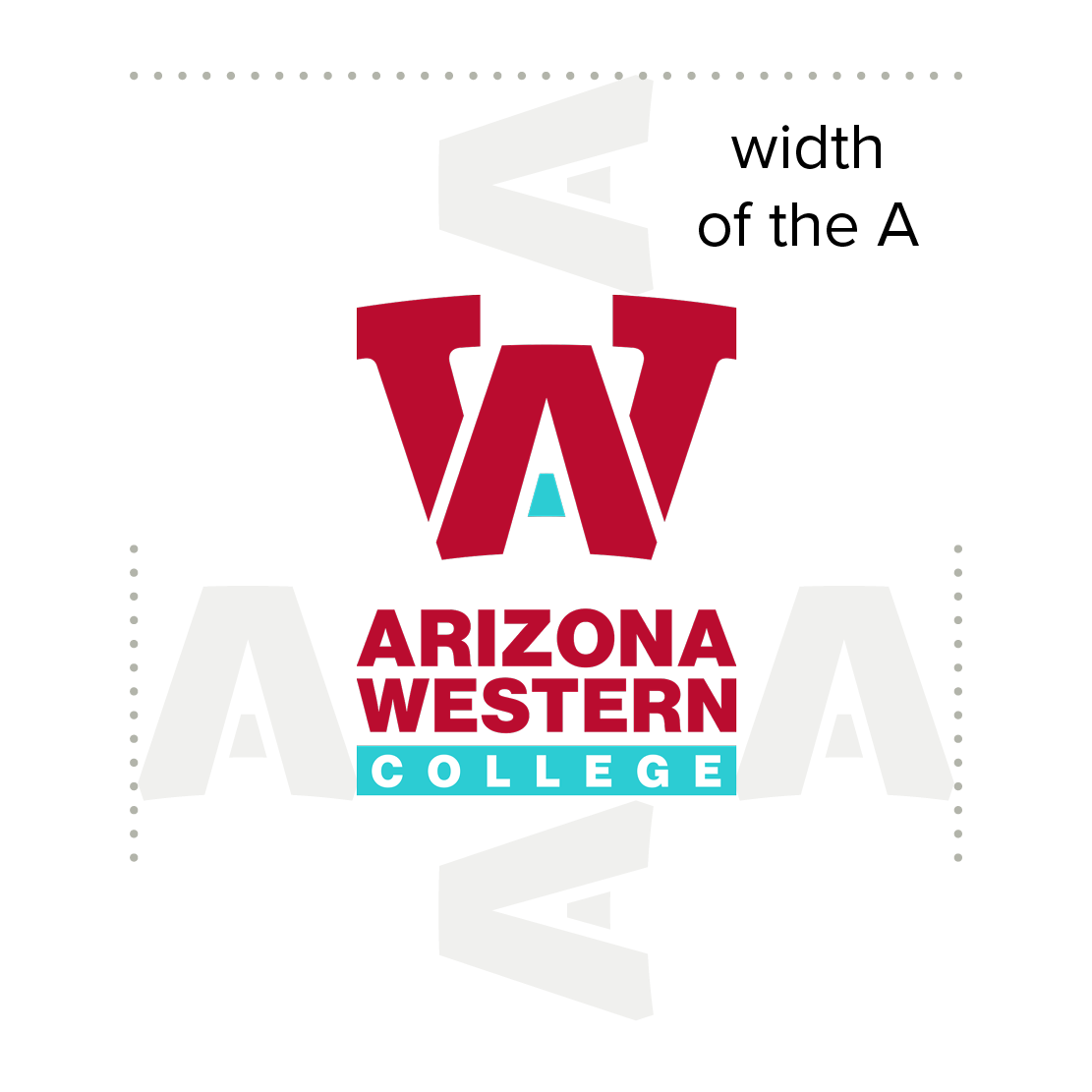
Do provide spacing around the logo equal to the width of the A
Do use on solid background
Do keep all elements together
Do follow minimum height requirements:
Vertical logo: 1” / Horizontal logo: .5”

Do not use the logo next to an object or text without adequate spacing
